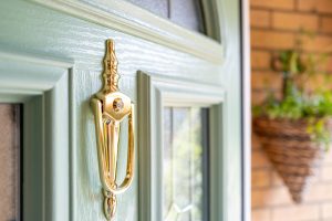
Pale green composite door
Colour is a very potent tool for architects looking to enhance streamlined design. It is a popular method used to embellish new building design and when it comes to modern properties, colour provides a strong statement for high end buildings.
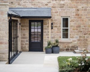
Architects and designers have always favoured subtle tones such as greys, pale greens and blues as well as the popular black and white when it comes to building design and renovation projects.
 Currently however, they have realised that a brighter, bolder colour on windows and doors, can really help to make a building stand out in such a positive way – in particular when it comes to creating a feel-good factor about a city.
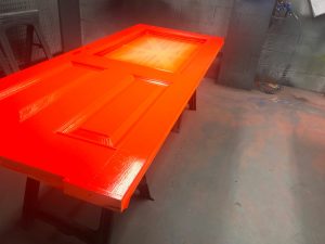
Touches of colour in bolder blues and reds on composite doors can now be seen in city renovation projects across the UK, which are adding to the attractiveness to cities such as Manchester, Birmingham, Liverpool and Glasgow.
Enhancing building or home design does not have to stop at the exterior, as architects are keen to explore balancing colour on the inside too….colour is an excellent way to enhance glass walls as beautiful detail on a project.
 Also, inspired by nature, the Kolorseal team has noticed how commercial and PSB projects are being influenced by the natural world. Universal associations with colours such as sky blue and heather purple and the yellow of the sun are all becoming increasingly popular on colour coating projects in respect of windows, doors, rainwater and composite doors.
As nature blends so easily with green and blue hues, it is evident that some architectural companies are making their designs stand out creating a natural, soothing appearance for those viewing them. This can be seen clearly in conservatory and orangery design.
According to Deborah Hendry, Managing Director at Kolorseal, earth-driven elements in buildings, both externally and internally, by association have very positive psychological effects for occupants and visitors,.
She comments, “Adding a touch of colour such as blue, sage green, dark green or even pink will all help to create a ‘mood’ for those visiting any building or property with coloured windows and doors. They enhance the overall feel.
Blue and pale green are colours which make people noticeably calm when exposed to them. People’s emotions can be affected by colours used and this can enhance a building’s use. For example, a gym is a dynamic colour that emboldens people who visit, which naturally explains its use and purpose to planners when making window and door choices.”
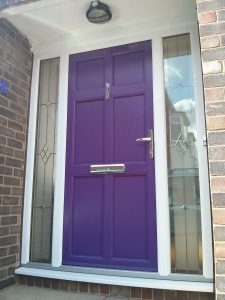 For architects, finding the right colour balance is essential and they are exploring new avenues with pastels such as pink and lilac to make dramatic statements in their domestic window and commercial design concepts.
Deborah considers that experienced architects understand the power that colour specifications and the psychology of them have on building occupants.
She concludes, “As an award winning company, with many years experience, Kolorseal is well versed in colourful ergonomics that are helping architects to make the right statements.
We fully understand the perception of colours and how an architect will want to employ the choice of shade they opt for in their designs. We know that science and aesthetics will help to improve building design.
With virtually any colour available, from RAL charts to Farrow & Ball and beyond, we aim to support architects and specifiers as they look to create visually stimulating concepts on windows, doors and beyond, that will stand out in the best way.”