Kolorseal Ltd has been advising developers recently on the best colour options for senior living developments. When it comes to elderly care, colour is more than a simple visual aspect – as we age it becomes part of our language. In fact, the term ‘Dementia Friendly’ options are now being offered by a number of paint brands.
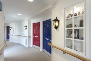
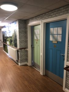
When it comes to using colour to the best advantage, many senior living environments use different shades of colour for navigation, with floors denoted by a specific colour, but a wide variety of hues in that colour will be needed for occupants’ individual doors.

Debbie Hendry, Managing Director, Kolorseal Ltd comments, “Colour psychology studies show that certain shades can trigger distinct emotional responses. Frequently blue is associated as a calming influence while green provides a sense of harmony.
In respect of senior living environments, the right colour choice is vital for creating a feeling of comfort and safety.”
It is recognised that as people age, their colour concept alters as sensitivity to certain shades generally declines.
Understanding the physiological changes when creating new senior living spaces is critical, Debbie believes.
As time progresses, warmer tones such as lemons and amber hues can bring comfort, helping to compensate for the yellowing of the lens which happens as we age. Exceedingly bright or contrasting colours should be avoided as these can be disconcerting and upsetting for some residents.
When choosing a colour scheme for senior living homes it is important to remember how this will impact the residents’ moods, their cognitive function and their overall well being.
Navigation is another crucial aspect to consider as the right colours are used to create familiarity of surroundings, and these will minimise feelings of anxiety or confusion, particularly for those residents with dementia.
Things to consider when planning or design senior living environments:
Well-being:
Different emotional responses will be triggered depending on the shades used – cooler colours such as blues, lilacs and greens will help to create relaxing, safe and calm environments.
- Cognitive Function:
With age it becomes more difficult to distinguish colours and contrasts.
High-contrast colour schemes, differentiating walls, floors, and furniture, greatly help residents navigate spaces easily and maintain their independence.
For those residents with dementia, specific shades can aid in memory recall and reduce confusion.
- Navigation:
Colour-coded communal areas will assist in identifying particular spaces within a facility.
Using the right colour for highlighting key features, such as exits, can greatly reduce disorientation and the risk of falling.
- Creates a Welcoming Atmosphere:
Planners and designers can create a welcoming environment which feels like home to residents. The Kolorseal team has experience in advising which shades will work best in respect of inducing positive memories.
- Minimising Anxiety:
Certain colours will help to soothe residents, particularly those with dementia. Providing a predictable environment using the right colours can help with improved sleep and comfort.
Debbie concludes, “
Thoughtful colour consideration is the key to enhancing residents’ quality of life. Being able to understand colour psychology ensures that any builder, developer, planner or architect is supporting the emotional and cognitive needs of elderly residents.
The right shades in the right places will ensure that this consideration will demonstrate an appreciation to the needs of the elderly that ultimately will offer nurturing and life-enhancing spaces.”
Kolorseal Ltd is an award winning colour coating specialist with over 20 years experience in the fenestration and construction sectors. Call the team for more information or advice on 01924 454 856
Ends